Dreams and Schemes
 “Dreams and schemes and circus crowds”. These are words from Joni Mitchell’s “Both Sides Now”. They can evoke many different kinds of reactions and responses from the audience and the song has been an inspiration for a lot of my work.
My theme for my current wall exhibit at Off Track Gallery is “Dreams and Schemes”.
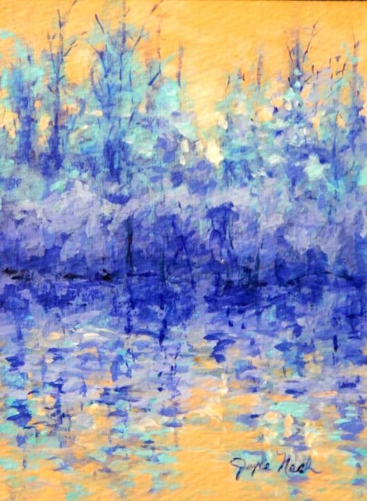
Much of my work contains areas of mystery….some intentional and some resulting from happy accidents. “Marsh Mystique” started as one of my “Sanctuary” series paintings. My intention this time was part of a set of color “Scheme” experiments. I used a limited palette with the Complementary colors yellow and violet. As I was rendering a scene in the Tillman Marsh, a “happy accident” was occurring in the background and I began to question what was happening there. A lost city perhaps? I thought I’d leave the element of mystery there and leave it to the imagination of the audience.
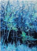
 Another painting on this wall using this complementary color scheme is “Sanctuary 16” which at first glance is a purely representational rendering of the marsh. Here I tried to create a dreamy quality with paths of very dark values of violet to lead the observer further deep into the darkest, most mysterious areas of the marsh.
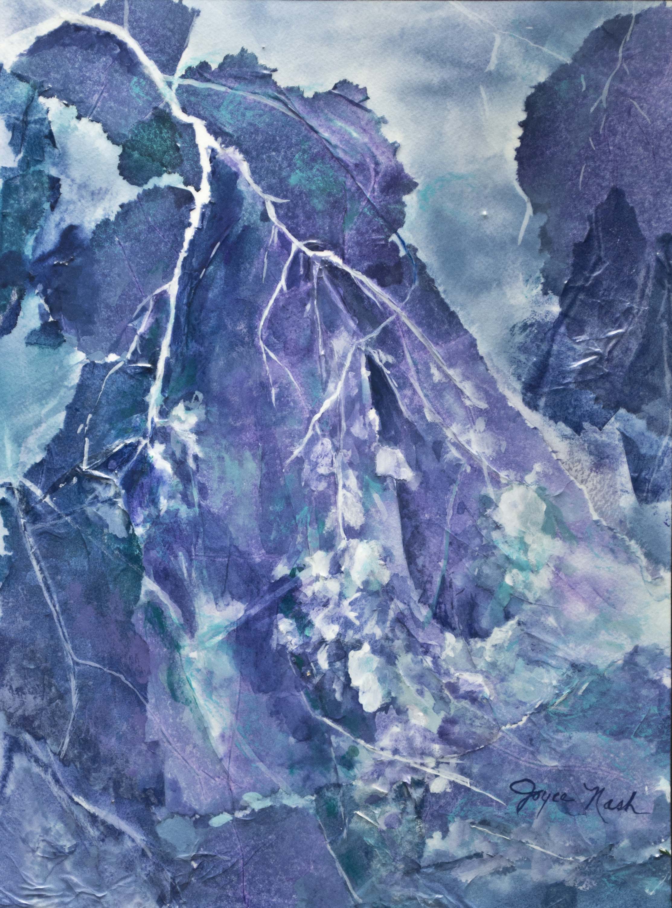
 “A Dream in Violet” began as a fairly realistic rendering of eucalyptus tree branches using an analogous color scheme with shades of blue and violet. I started with torn pieces of stained tissue paper all the time working from reference photos of eucalyptus branches. As I started to define the leaf shapes, I noticed stories forming in the background areas. I could have rendered them to suit my interpretation but decided to allow those areas to keep a mysterious abstraction. I left the interpretation to the observer. “Sanctuary 27” also uses this analogous color scheme.
 I wanted a monochromatic color scheme for “Blue Marsh”. It is meant to convey a thoughtful, meditative, tranquil mood. I don’t mean any sadness here and wanted the Canada Geese to be a “couple”, together, and definitely not sad. I chose blue because I like it.
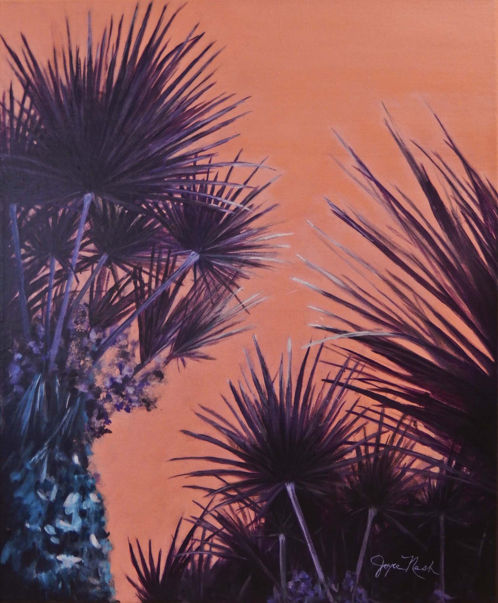 Another limited palette scheme I’m using in this exhibit is seen in “Purple Palms”. It could be labeled an analogous scheme of red orange, red and red violet. I did not use pure red at all but there is some of its complement green. My main point of interest here was the pattern created as the palm fronds crossed each other. I wanted the negative red orange spaces to pop and entertain the observer.
The lyrics to “Both Sides Now” inspire a lot of themes for me. I’m currently working on a series of paintings using clouds. There are lots of possibilities here. Sunrises, sunsets, of course. But how about “Ice cream castles in the air”? Let me surprise you.